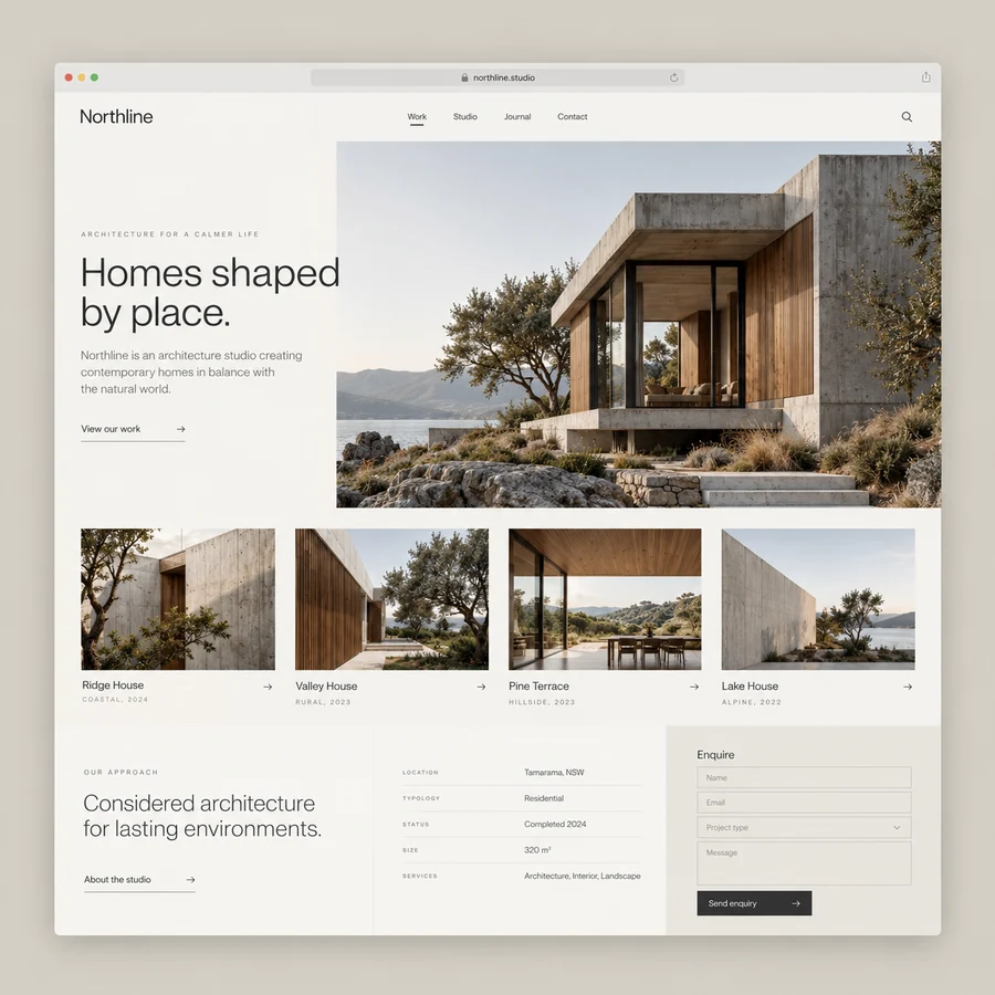
A coherent project collection
The collection uses a consistent image rhythm and concise project labels. Categories should reflect the studio’s actual work, while the layout leaves enough space for photographs to communicate material and setting.


Give the work room to speak.
An architecture website concept using restrained typography, project photography, and a focused enquiry path.
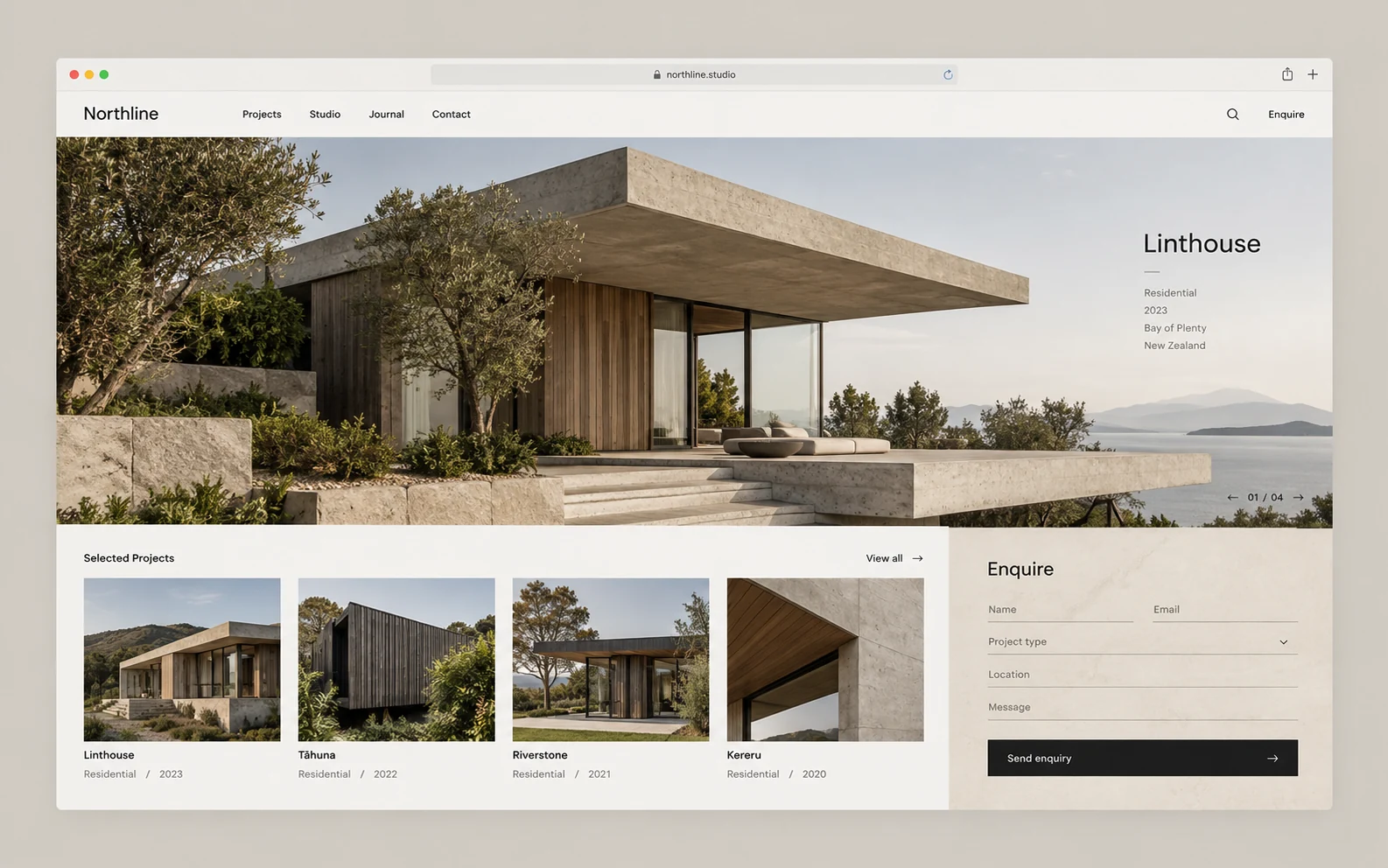
Northline explores a marketing website for an architecture studio. The design gives building photography, project context, and the studio’s approach a clear editorial structure. Monochrome typography and warm stone accents create a minimal presentation that lets the projects carry the visual character.
Prospective clients comparing a studio’s work and staff maintaining project descriptions and imagery.
A photography-led website can create a strong first impression while leaving visitors uncertain about the studio’s capabilities or how to begin a conversation. Northline studies how a project grid, detailed project pages, and a focused enquiry path can connect visual work to practical context.
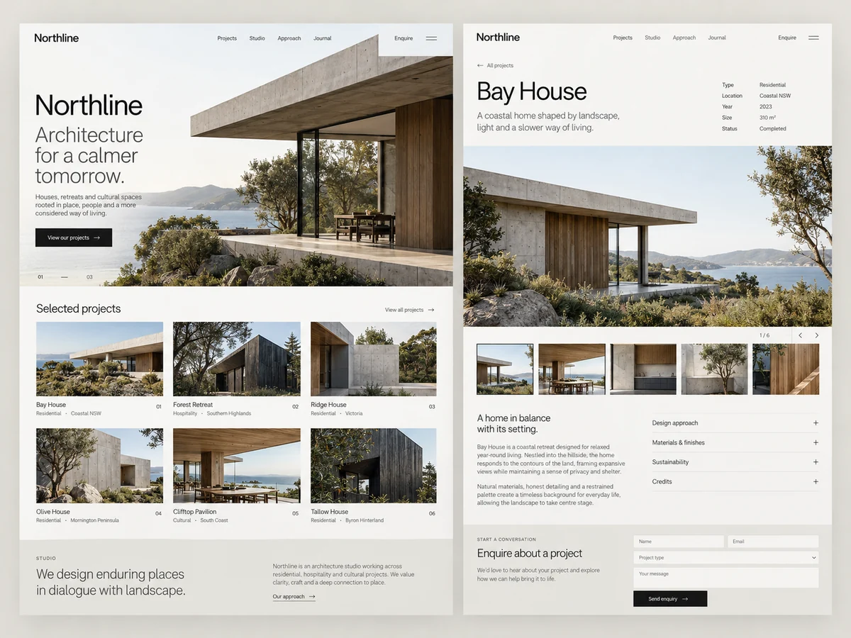
The collection uses a consistent image rhythm and concise project labels. Categories should reflect the studio’s actual work, while the layout leaves enough space for photographs to communicate material and setting.
A project page pairs larger photographs with a short brief, design decisions, and relevant details. The content structure can accommodate different projects without forcing every story into the same length.
The enquiry area asks for the context needed to begin a conversation. Inputs are labeled clearly, and the confirmation explains the next step without making an unverified response-time promise.
A visitor scans the project collection and chooses a relevant building or type of work.
Photography and concise context explain the project’s design direction and the studio’s role.
The visitor can share their project context without navigating away from the information that informed their decision.
A proposed website would use structured project content, optimized photography, and responsive page templates.
The content editing approach should make image order, captions, and project metadata manageable by staff.
Release checks would include navigation, forms, keyboard access, image loading, and changed URLs where relevant.
This study establishes a reviewable design direction. A production project would test the selected journey with representative users, realistic data, and agreed acceptance criteria. These questions define the next review without implying results have already been measured.
Share your audience, the task you want to improve, and the constraints that matter. We can discuss a scope built around your own context.
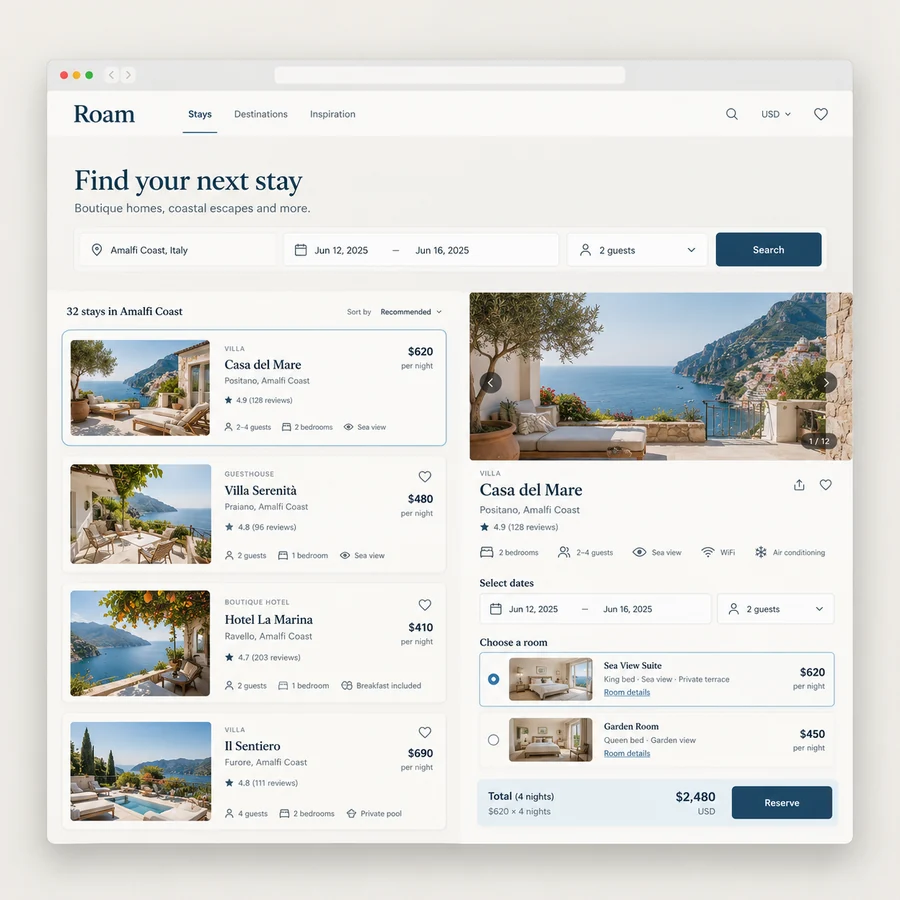
A travel booking website concept that keeps availability, room options, and price context close to the decision.
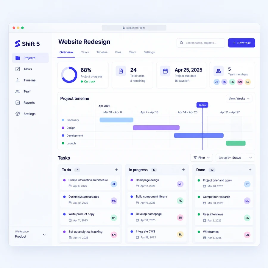
A project management design study connecting tasks, timelines, and ownership in a focused SaaS workspace.
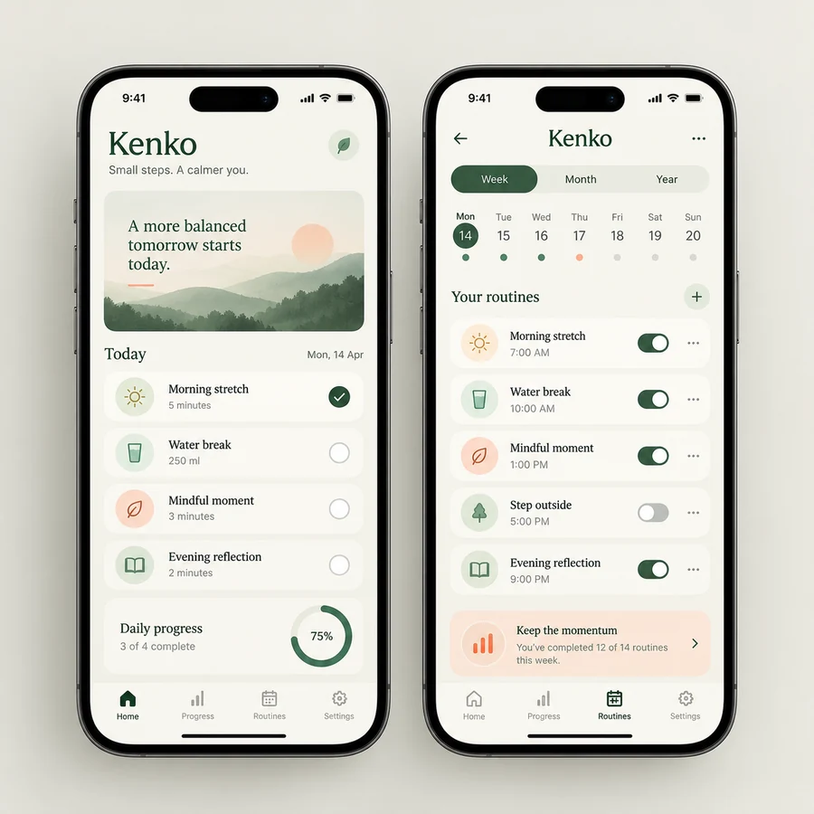
A mobile habit app concept with a clear daily view, manageable routines, and considerate progress feedback.