
A personal starting point
Onboarding asks for a small number of preferences and an initial routine. Each question explains how the answer changes the experience. The user can review the choice and begin without completing a long profile.


Small routines. A useful daily rhythm.
A mobile habit app concept with a clear daily view, manageable routines, and considerate progress feedback.
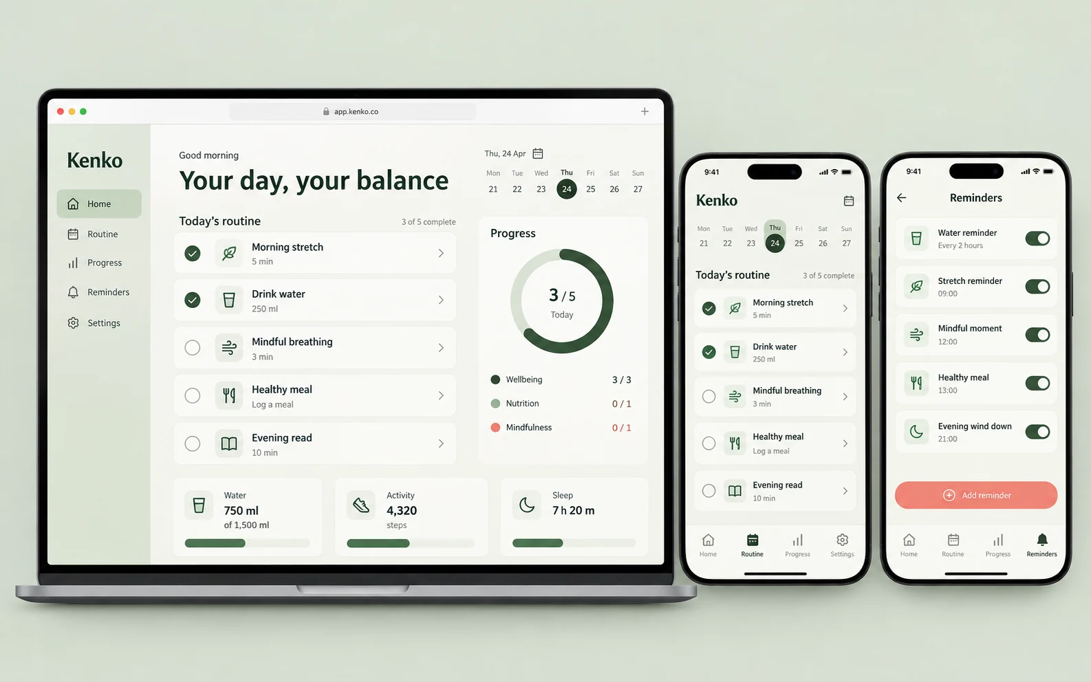
Kenko is a mobile product study for people who want a manageable daily routine. Sage, ivory, and small coral accents create a calm interface, while the screen hierarchy gives one useful next action prominence. The product direction supports personal habit tracking; it does not offer diagnosis, treatment, or claims about health outcomes.
People building everyday habits who need lightweight planning and feedback without an overwhelming dashboard.
Habit applications can ask for too much setup, reward activity without context, or make a missed day feel like failure. Kenko explores a smaller set of screens that explain the current routine and let the user adjust it. The challenge is to make progress understandable while respecting different schedules and levels of participation.
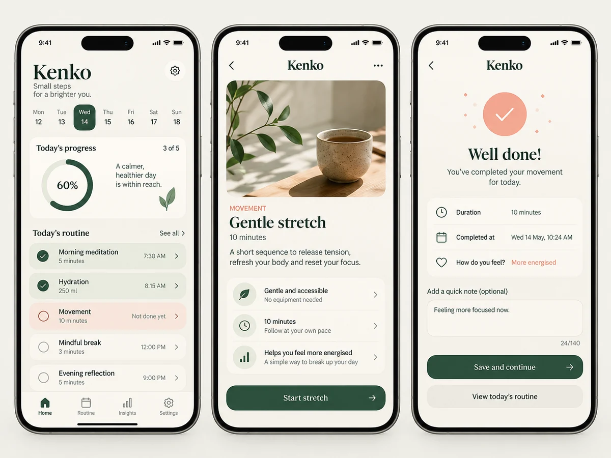
Onboarding asks for a small number of preferences and an initial routine. Each question explains how the answer changes the experience. The user can review the choice and begin without completing a long profile.
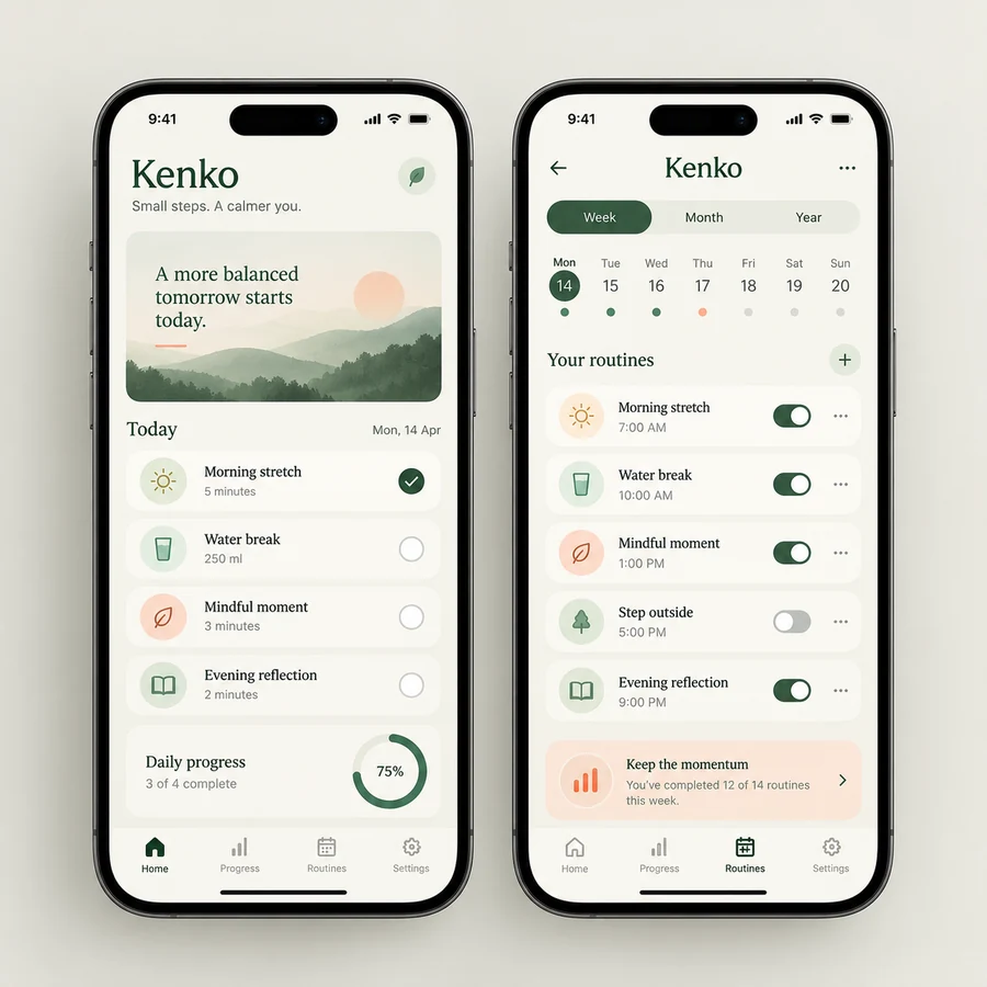
Routine cards show the intended action, its current state, and the next useful control. A simple week view provides context without competing with the main task. Missed actions can be rescheduled or left incomplete without misleading feedback.
The progress screen distinguishes completed activities from plans and allows a user to review their own pattern. Reminder settings are accessible from the same context, with clear choices about timing and notifications.
The user selects a manageable activity and reviews when it should appear. They see a preview of the daily screen before confirming the plan.
The daily view offers an understandable action and feedback. If the plan no longer fits, changing it is a normal part of the journey.
The user can look back at recorded participation, update reminders, and choose the next routine without a claim that the app has measured wellbeing.
A proposed mobile build would define local state, account synchronization if needed, and notification permissions separately.
Reminder timing and stored routine data need review across time zones, offline use, and device changes.
Accessibility checks would include text scaling, touch targets, focus order, and reduced-motion preferences.
This study establishes a reviewable design direction. A production project would test the selected journey with representative users, realistic data, and agreed acceptance criteria. These questions define the next review without implying results have already been measured.
Share your audience, the task you want to improve, and the constraints that matter. We can discuss a scope built around your own context.
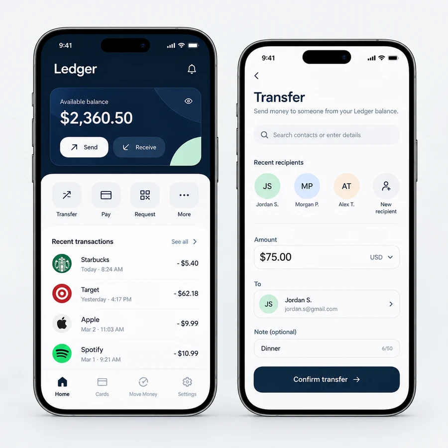
A digital wallet interface concept with readable account activity and deliberate transfer review.
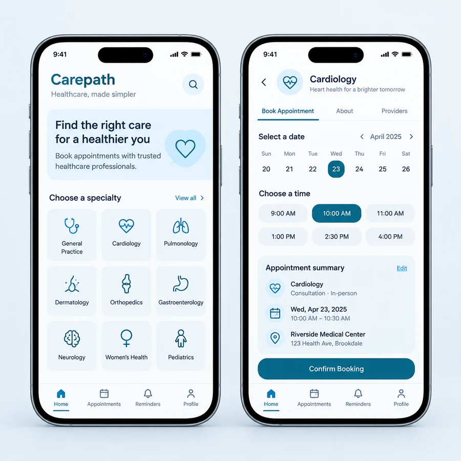
An appointment booking app design study with clear availability, booking review, and visit-management screens.
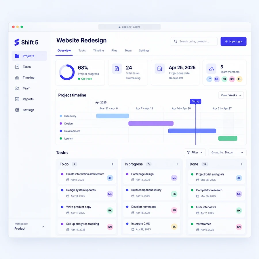
A project management design study connecting tasks, timelines, and ownership in a focused SaaS workspace.